
Elements#
The imgui elements as they exist in imgui_bundle. Each element is shown with the code that produced its
image, which runs as it is written. See the imgui guide for adding a UI to a Figure.
An argument typed ImVec2 or ImVec4 also takes a tuple or a list.
The examples use imgui, icons_fontawesome_6 as fa and numpy as np.
Text#
Text elements are read-only, they display a value that the user cannot edit.
text#
Parameters
fmt- the text to draw
n_peaks = 137

imgui.text(f"peaks found: {n_peaks}")

text_colored#
- imgui.text_colored(col: ImVec4, fmt: str) None
shortcut for PushStyleColor(ImGuiCol_Text, col); Text(fmt, …); PopStyleColor();
Parameters
col- text color,(r, g, b, a)in0.0to1.0fmt- the text to draw
vmin, vmax = 180.0, 60.0

if vmin > vmax:
    imgui.text_colored((1.0, 0.3, 0.3, 1.0), f"{fa.ICON_FA_TRIANGLE_EXCLAMATION} vmin > vmax")

text_disabled#
- imgui.text_disabled(fmt: str) None
shortcut for PushStyleColor(ImGuiCol_Text, style.Colors[ImGuiCol_TextDisabled]); Text(fmt, …); PopStyleColor();
Parameters
fmt- the text to draw
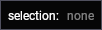
selected = None

imgui.text("selection:")
imgui.same_line()

if selected is None:
    imgui.text_disabled("none")
else:
    imgui.text(selected)
text_wrapped#
- imgui.text_wrapped(fmt: str) None
shortcut for PushTextWrapPos(0.0); Text(fmt, …); PopTextWrapPos();. Note that this won’t work on an auto-resizing window if there’s no other widgets to extend the window width, yoy may need to set a size using SetNextWindowSize().
Parameters
fmt- the text to draw, wrapped at the right edge of the window
imgui.text_wrapped("the filter runs on the full frame, it can take a few seconds for large images")

label_text#
- imgui.label_text(label: str, fmt: str) None
display text+label aligned the same way as value+label widgets
Parameters
label- drawn to the right of the value, aligned the same way as the label of a slider or an inputfmt- the value to draw
data = np.random.randint(0, 4096, (512, 512), dtype=np.uint16)

imgui.label_text("shape", str(data.shape))
imgui.label_text("dtype", str(data.dtype))
imgui.label_text("range", f"{data.min()} - {data.max()}")

bullet_text#
Parameters
fmt- the text to draw after the bullet
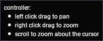
imgui.text("controller:")
imgui.bullet_text("left click drag to pan")
imgui.bullet_text("right click drag to zoom")
imgui.bullet_text("scroll to zoom about the cursor")
separator_text#
Parameters
label- the text to draw in the separator
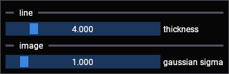
thickness, sigma = 4.0, 1.0

imgui.separator_text("line")
changed, thickness = imgui.slider_float("thickness", v=thickness, v_min=1.0, v_max=20.0)

imgui.separator_text("image")
changed, sigma = imgui.slider_float("gaussian sigma", v=sigma, v_min=0.1, v_max=10.0)
Widgets#
button#
Note
If size is None, then its default value will be: ImVec2(0, 0)
Parameters
label- drawn on the button,"##hidden"suppresses itsize-(width, height), a zero component is sized to the label, a negative one fills the available space
Returns: True on the frame the button is clicked
if imgui.button("autoscale"):
    print("autoscale clicked")

if imgui.button(fa.ICON_FA_TRASH):
    print("trash clicked")
if imgui.is_item_hovered():
    imgui.set_tooltip("remove all graphics")

small_button#
Parameters
label- drawn on the button
Returns: True on the frame the button is clicked
vmin, vmax = 12.0, 208.0

imgui.text(f"vmin {vmin:.0f}, vmax {vmax:.0f}")
imgui.same_line()

if imgui.small_button("reset"):
    vmin, vmax = 0.0, 255.0

arrow_button#
Parameters
str_id- identifies the button, it is not drawndir-imgui.Dir.left,right,upordown
Returns: True on the frame the button is clicked
channel, n_channels = 1, 4

if imgui.arrow_button("previous", imgui.Dir.left):
    channel = max(0, channel - 1)

imgui.same_line()
imgui.text(f"channel {channel}")

imgui.same_line()
if imgui.arrow_button("next", imgui.Dir.right):
    channel = min(n_channels - 1, channel + 1)

invisible_button#
- imgui.invisible_button(str_id: str, size: ImVec2, flags: int = 0) bool
flexible button behavior without the visuals, frequently useful to build custom behaviors using the public api (along with IsItemActive, IsItemHovered, etc.)
flags takes imgui.ButtonFlags_
Parameters
str_id- identifies the button, nothing is drawnsize-(width, height)of the area that responds to the pointer
Returns: True on the frame the button is clicked
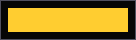
An invisible button gives the pointer behavior of a button to an area that you draw yourself. The pointer is over the button in the image below, so the bar is drawn in its highlighted color.
draw_list = imgui.get_window_draw_list()
position = imgui.get_cursor_screen_pos()

imgui.invisible_button("threshold-bar", (120, 24))

color = (1.0, 0.8, 0.2, 1.0) if imgui.is_item_hovered() else (0.4, 0.4, 0.4, 1.0)
draw_list.add_rect_filled(
    position, (position.x + 120, position.y + 24), imgui.color_convert_float4_to_u32(color)
)
checkbox#
Parameters
label- drawn to the right of the boxv- the current state
Returns: (changed, v)
axes_visible, grid_visible = True, False

changed, axes_visible = imgui.checkbox("axes", axes_visible)
changed, grid_visible = imgui.checkbox("grid", grid_visible)

checkbox_flags#
Overloads
Parameters
label- drawn to the right of the boxflags- theintthat holds the bitsflags_value- the bit that this checkbox sets and clears
Returns: (changed, flags)
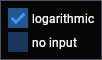
The box is checked when the bit is set, and is drawn filled when flags_value holds several bits and only some of
them are set.
slider_flags = int(imgui.SliderFlags_.logarithmic)

changed, slider_flags = imgui.checkbox_flags(
    "logarithmic", slider_flags, int(imgui.SliderFlags_.logarithmic)
)
changed, slider_flags = imgui.checkbox_flags(
    "no input", slider_flags, int(imgui.SliderFlags_.no_input)
)
radio_button#
Overloads
- imgui.radio_button(label: str, active: bool) bool
use with e.g. if (RadioButton(“one”, my_value==1)) { my_value = 1; }
- imgui.radio_button(label: str, v: int, v_button: int) tuple[bool, int]
shortcut to handle the above pattern when value is an integer
Parameters
label- drawn to the right of the buttonactive- whether this button is the selected onev,v_button- the variable that holds the selection, and the value of this button
Returns: True on the frame the button is clicked, or (changed, v) for the second form
Use radio buttons for a small number of options that are all worth showing, a combo box is better for a long list.
mode = 1

for i, label in enumerate(["line", "scatter", "heatmap"]):
    if imgui.radio_button(label, mode == i):
        mode = i

progress_bar#
- imgui.progress_bar(fraction: float, size_arg: ImVec2 | None = None, overlay: str | None = None) None
Note
If size_arg is None, then its default value will be: ImVec2(-sys.float_info.min, 0)
Parameters
fraction-0.0to1.0size_arg-(width, height), the default fills the available widthoverlay- text drawn on the bar, the percentage is drawn if it is not given
n_done, n_frames = 317, 500

imgui.progress_bar(n_done / n_frames, overlay=f"{n_done} / {n_frames} frames")

bullet#
- imgui.bullet() None
draw a small circle + keep the cursor on the same line. advance cursor x position by GetTreeNodeToLabelSpacing(), same distance that TreeNode() uses
Parameters
none
shape = (500, 512, 512)

imgui.bullet()
imgui.text(f"{shape[0]} frames")

imgui.bullet()
imgui.text(f"{shape[1]} x {shape[2]} pixels")

Sliders#
A slider is dragged between a lower and an upper bound. A drag has no bound by default and changes its value by how far the pointer moves, which suits a value with no natural range. Ctrl+click either of them to type a value instead.
format is a printf format, it is applied to the value drawn on the element, e.g. "%.1f px".
slider_float#
- imgui.slider_float(label: str, v: float, v_min: float, v_max: float, format: str = '%.3f', flags: int = 0) tuple[bool, float]
adjust format to decorate the value with a prefix or a suffix for in-slider labels or unit display.
flags takes imgui.SliderFlags_
Parameters
label- drawn to the right of the slider,"##hidden"suppresses itv- the current valuev_min,v_max- the bounds, the value is clamped to themformat- printf format of the value drawn on the slider
Returns: (changed, v)
thickness = 4.0

changed, thickness = imgui.slider_float("thickness", v=thickness, v_min=1.0, v_max=20.0)

slider_float2#
- imgui.slider_float2(label: str, v: Sequence[float], v_min: float, v_max: float, format: str = '%.3f', flags: int = 0) tuple[bool, list[float]]
flags takes imgui.SliderFlags_
Two values on one row, sharing one pair of bounds. Pass a list and use the list that comes back.
Parameters
label- drawn to the right of the slidersv- the current valuesv_min,v_max- the bounds, applied to both componentsformat- printf format of the values drawn on the sliders
Returns: (changed, v)
vmin_vmax = [12.0, 208.0]

changed, vmin_vmax = imgui.slider_float2("vmin / vmax", vmin_vmax, 0.0, 255.0, format="%.0f")

slider_float3#
- imgui.slider_float3(label: str, v: Sequence[float], v_min: float, v_max: float, format: str = '%.3f', flags: int = 0) tuple[bool, list[float]]
flags takes imgui.SliderFlags_
Parameters
label- drawn to the right of the slidersv- the current valuesv_min,v_max- the bounds, applied to every componentformat- printf format of the values drawn on the sliders
Returns: (changed, v)
spacing = [1.0, 1.0, 3.0]

changed, spacing = imgui.slider_float3("voxel spacing", spacing, 0.1, 10.0, format="%.2f")

slider_float4#
- imgui.slider_float4(label: str, v: Sequence[float], v_min: float, v_max: float, format: str = '%.3f', flags: int = 0) tuple[bool, list[float]]
flags takes imgui.SliderFlags_
Parameters
label- drawn to the right of the slidersv- the current valuesv_min,v_max- the bounds, applied to every componentformat- printf format of the values drawn on the sliders
Returns: (changed, v)
extent = [0.1, 0.9, 0.1, 0.9]

changed, extent = imgui.slider_float4("extent", extent, 0.0, 1.0, format="%.2f")

slider_int#
- imgui.slider_int(label: str, v: int, v_min: int, v_max: int, format: str = '%d', flags: int = 0) tuple[bool, int]
flags takes imgui.SliderFlags_
Parameters
label- drawn to the right of the sliderv- the current valuev_min,v_max- the bounds, the value is clamped to themformat- printf format of the value drawn on the slider
Returns: (changed, v)
n_bins = 100

changed, n_bins = imgui.slider_int("bins", v=n_bins, v_min=10, v_max=500)

slider_int2#
- imgui.slider_int2(label: str, v: Sequence[int], v_min: int, v_max: int, format: str = '%d', flags: int = 0) tuple[bool, list[int]]
flags takes imgui.SliderFlags_
Parameters
label- drawn to the right of the slidersv- the current valuesv_min,v_max- the bounds, applied to both componentsformat- printf format of the values drawn on the sliders
Returns: (changed, v)
crop = [64, 448]

changed, crop = imgui.slider_int2("crop rows", crop, 0, 512)

slider_int3#
- imgui.slider_int3(label: str, v: Sequence[int], v_min: int, v_max: int, format: str = '%d', flags: int = 0) tuple[bool, list[int]]
flags takes imgui.SliderFlags_
Parameters
label- drawn to the right of the slidersv- the current valuesv_min,v_max- the bounds, applied to every componentformat- printf format of the values drawn on the sliders
Returns: (changed, v)
stride = [1, 2, 2]

changed, stride = imgui.slider_int3("stride", stride, 1, 8)

slider_int4#
- imgui.slider_int4(label: str, v: Sequence[int], v_min: int, v_max: int, format: str = '%d', flags: int = 0) tuple[bool, list[int]]
flags takes imgui.SliderFlags_
Parameters
label- drawn to the right of the slidersv- the current valuesv_min,v_max- the bounds, applied to every componentformat- printf format of the values drawn on the sliders
Returns: (changed, v)
roi = [64, 64, 256, 256]

changed, roi = imgui.slider_int4("roi", roi, 0, 512)

slider_angle#
- imgui.slider_angle(label: str, v_rad: float, v_degrees_min: float = -360.0, v_degrees_max: float = 360.0, format: str = '%.0f deg', flags: int = 0) tuple[bool, float]
flags takes imgui.SliderFlags_
The value is in radians, the bounds and the value drawn on the slider are in degrees.
Parameters
label- drawn to the right of the sliderv_rad- the current angle, in radiansv_degrees_min,v_degrees_max- the bounds, in degreesformat- printf format of the angle drawn on the slider
Returns: (changed, v_rad)
rotation = 0.6

changed, rotation = imgui.slider_angle("rotation", v_rad=rotation, v_degrees_min=-180, v_degrees_max=180)

drag_float#
- imgui.drag_float(label: str, v: float, v_speed: float = 1.0, v_min: float = 0.0, v_max: float = 0.0, format: str = '%.3f', flags: int = 0) tuple[bool, float]
If v_min >= v_max we have no bound
flags takes imgui.SliderFlags_
Parameters
label- drawn to the right of the elementv- the current valuev_speed- how much the value changes per pixel of pointer movementv_min,v_max- the bounds, there is no bound whilev_min >= v_maxformat- printf format of the value drawn on the element
Returns: (changed, v)
sigma = 1.4

changed, sigma = imgui.drag_float("gaussian sigma", v=sigma, v_speed=0.05, v_min=0.1, v_max=20.0)

drag_float2#
- imgui.drag_float2(label: str, v: Sequence[float], v_speed: float = 1.0, v_min: float = 0.0, v_max: float = 0.0, format: str = '%.3f', flags: int = 0) tuple[bool, list[float]]
flags takes imgui.SliderFlags_
Parameters
label- drawn to the right of the elementsv- the current valuesv_speed- how much a value changes per pixel of pointer movementv_min,v_max- the bounds, applied to both components, there is no bound whilev_min >= v_maxformat- printf format of the values drawn on the elements
Returns: (changed, v)
origin = [0.0, 0.0]

changed, origin = imgui.drag_float2("origin", origin, v_speed=0.5)

drag_float3#
- imgui.drag_float3(label: str, v: Sequence[float], v_speed: float = 1.0, v_min: float = 0.0, v_max: float = 0.0, format: str = '%.3f', flags: int = 0) tuple[bool, list[float]]
flags takes imgui.SliderFlags_
Parameters
label- drawn to the right of the elementsv- the current valuesv_speed- how much a value changes per pixel of pointer movementv_min,v_max- the bounds, applied to every component, there is no bound whilev_min >= v_maxformat- printf format of the values drawn on the elements
Returns: (changed, v)
offset = [0.0, 0.0, 0.0]

changed, offset = imgui.drag_float3("offset", offset, v_speed=0.5)

drag_float4#
- imgui.drag_float4(label: str, v: Sequence[float], v_speed: float = 1.0, v_min: float = 0.0, v_max: float = 0.0, format: str = '%.3f', flags: int = 0) tuple[bool, list[float]]
flags takes imgui.SliderFlags_
Parameters
label- drawn to the right of the elementsv- the current valuesv_speed- how much a value changes per pixel of pointer movementv_min,v_max- the bounds, applied to every component, there is no bound whilev_min >= v_maxformat- printf format of the values drawn on the elements
Returns: (changed, v)
bounds = [0.0, 512.0, 0.0, 512.0]

changed, bounds = imgui.drag_float4("bounds", bounds, v_speed=1.0, format="%.0f")

drag_float_range2#
- imgui.drag_float_range2(label: str, v_current_min: float, v_current_max: float, v_speed: float = 1.0, v_min: float = 0.0, v_max: float = 0.0, format: str = '%.3f', format_max: str | None = None, flags: int = 0) tuple[bool, float, float]
flags takes imgui.SliderFlags_
Two values that cannot cross, the lower one is dragged from the left half and the upper one from the right half.
Parameters
label- drawn to the right of the elementv_current_min,v_current_max- the current valuesv_speed- how much a value changes per pixel of pointer movementv_min,v_max- the bounds, there is no bound whilev_min >= v_maxformat- printf format of the lower valueformat_max- printf format of the upper value,formatis used for both if it is not given
Returns: (changed, v_current_min, v_current_max)
vmin, vmax = 12.0, 208.0

changed, vmin, vmax = imgui.drag_float_range2(
    "vmin / vmax", vmin, vmax, v_speed=1.0, v_min=0.0, v_max=255.0, format="%.0f"
)

drag_int#
- imgui.drag_int(label: str, v: int, v_speed: float = 1.0, v_min: int = 0, v_max: int = 0, format: str = '%d', flags: int = 0) tuple[bool, int]
If v_min >= v_max we have no bound
flags takes imgui.SliderFlags_
Parameters
label- drawn to the right of the elementv- the current valuev_speed- how much the value changes per pixel of pointer movementv_min,v_max- the bounds, there is no bound whilev_min >= v_maxformat- printf format of the value drawn on the element
Returns: (changed, v)
window = 30

changed, window = imgui.drag_int("window size", v=window, v_speed=1.0, v_min=1, v_max=500)

drag_int_range2#
- imgui.drag_int_range2(label: str, v_current_min: int, v_current_max: int, v_speed: float = 1.0, v_min: int = 0, v_max: int = 0, format: str = '%d', format_max: str | None = None, flags: int = 0) tuple[bool, int, int]
flags takes imgui.SliderFlags_
Parameters
label- drawn to the right of the elementv_current_min,v_current_max- the current values, they cannot crossv_speed- how much a value changes per pixel of pointer movementv_min,v_max- the bounds, there is no bound whilev_min >= v_maxformat- printf format of the lower valueformat_max- printf format of the upper value,formatis used for both if it is not given
Returns: (changed, v_current_min, v_current_max)
first, last = 40, 260

changed, first, last = imgui.drag_int_range2("frames", first, last, v_min=0, v_max=500)

Input#
Input elements are typed into. A slider or a drag is better for a value that is explored by eye, an input is better for a value that is known.
input_text#
- imgui.input_text(label: str, str: str, flags: int = 0, callback: Callable[[InputTextCallbackData], int] | None = None, user_data: typing_extensions.CapsuleType | None = None) tuple[bool, str]
flags takes imgui.InputTextFlags_
Parameters
label- drawn to the right of the field,"##hidden"suppresses itstr- the current textcallback,user_data- an imgui input callback, for completion or filtering
Returns: (changed, str) - changed is True on every keystroke unless
imgui.InputTextFlags_ asks otherwise
name = "roi-1"

changed, name = imgui.input_text("graphic name", name)

input_text_multiline#
- imgui.input_text_multiline(label: str, str: str, size: ImVec2 | None = None, flags: int = 0, callback: Callable[[InputTextCallbackData], int] | None = None, user_data: typing_extensions.CapsuleType | None = None) tuple[bool, str]
flags takes imgui.InputTextFlags_
Note
If size is None, then its default value will be: ImVec2(0, 0)
Parameters
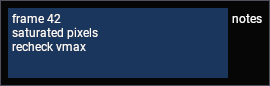
label- drawn to the right of the fieldstr- the current textsize-(width, height)of the field, a zero component is a default sizecallback,user_data- an imgui input callback
Returns: (changed, str)
notes = "frame 42\nsaturated pixels\nrecheck vmax"

changed, notes = imgui.input_text_multiline("notes", notes, (220, 70))
input_text_with_hint#
- imgui.input_text_with_hint(label: str, hint: str, str: str, flags: int = 0, callback: Callable[[InputTextCallbackData], int] | None = None, user_data: typing_extensions.CapsuleType | None = None) tuple[bool, str]
flags takes imgui.InputTextFlags_
The hint is drawn in the field while it is empty, use it instead of a label when there is no room for one.
Parameters
label- drawn to the right of the fieldhint- drawn in the field whilestris emptystr- the current textcallback,user_data- an imgui input callback
Returns: (changed, str)
pattern = ""

changed, pattern = imgui.input_text_with_hint("##filter", "filter graphics", pattern)

input_float#
- imgui.input_float(label: str, v: float, step: float = 0.0, step_fast: float = 0.0, format: str = '%.3f', flags: int = 0) tuple[bool, float]
flags takes imgui.InputTextFlags_
Parameters
label- drawn to the right of the fieldv- the current valuestep- amount the-and+buttons change the value by, they are not drawn while it is0.0step_fast- amount used while ctrl is heldformat- printf format of the value in the field
Returns: (changed, v)
threshold = 0.75

changed, threshold = imgui.input_float("threshold", v=threshold, step=0.05, step_fast=0.5)

input_float2#
- imgui.input_float2(label: str, v: Sequence[float], format: str = '%.3f', flags: int = 0) tuple[bool, list[float]]
flags takes imgui.InputTextFlags_
Two, three, and four fields on one row. Pass a list and use the list that comes back.
Parameters
label- drawn to the right of the fieldsv- the current valuesformat- printf format of the values in the fields
Returns: (changed, v)
pixel_size = [0.325, 0.325]

changed, pixel_size = imgui.input_float2("pixel size (um)", pixel_size, format="%.3f")

input_float3#
- imgui.input_float3(label: str, v: Sequence[float], format: str = '%.3f', flags: int = 0) tuple[bool, list[float]]
flags takes imgui.InputTextFlags_
Parameters
label- drawn to the right of the fieldsv- the current valuesformat- printf format of the values in the fields
Returns: (changed, v)
origin = [0.0, 0.0, 0.0]

changed, origin = imgui.input_float3("origin", origin, format="%.1f")

input_float4#
- imgui.input_float4(label: str, v: Sequence[float], format: str = '%.3f', flags: int = 0) tuple[bool, list[float]]
flags takes imgui.InputTextFlags_
Parameters
label- drawn to the right of the fieldsv- the current valuesformat- printf format of the values in the fields
Returns: (changed, v)
bounds = [0.0, 512.0, 0.0, 512.0]

changed, bounds = imgui.input_float4("bounds", bounds, format="%.0f")

input_int#
- imgui.input_int(label: str, v: int, step: int = 1, step_fast: int = 100, flags: int = 0) tuple[bool, int]
flags takes imgui.InputTextFlags_
Parameters
label- drawn to the right of the fieldv- the current valuestep- amount the-and+buttons change the value bystep_fast- amount used while ctrl is held
Returns: (changed, v)
n_components = 8

changed, n_components = imgui.input_int("components", v=n_components, step=1, step_fast=10)

input_int2#
flags takes imgui.InputTextFlags_
Parameters
label- drawn to the right of the fieldsv- the current values
Returns: (changed, v)
shape = [512, 512]

changed, shape = imgui.input_int2("output shape", shape)

input_int3#
flags takes imgui.InputTextFlags_
Parameters
label- drawn to the right of the fieldsv- the current values
Returns: (changed, v)
chunks = [1, 256, 256]

changed, chunks = imgui.input_int3("chunks", chunks)

input_int4#
flags takes imgui.InputTextFlags_
Parameters
label- drawn to the right of the fieldsv- the current values
Returns: (changed, v)
roi = [64, 64, 256, 256]

changed, roi = imgui.input_int4("roi", roi)

input_double#
- imgui.input_double(label: str, v: float, step: float = 0.0, step_fast: float = 0.0, format: str = '%.6f', flags: int = 0) tuple[bool, float]
flags takes imgui.InputTextFlags_
Parameters
label- drawn to the right of the fieldv- the current valuestep- amount the-and+buttons change the value by, they are not drawn while it is0.0step_fast- amount used while ctrl is heldformat- printf format of the value in the field
Returns: (changed, v)
exposure = 0.008

changed, exposure = imgui.input_double("exposure (s)", v=exposure, step=0.001, format="%.4f")

Selection#
combo#
Overloads
- imgui.combo(label: str, current_item: int, items: Sequence[str], popup_max_height_in_items: int = -1) tuple[bool, int]
- imgui.combo(label: str, current_item: int, items_separated_by_zeros: str, popup_max_height_in_items: int = -1) tuple[bool, int]
Separate items with \0 within a string, end item-list with \0\0. e.g. “One\0Two\0Three\0”
Parameters
label- drawn to the right of the box,"##hidden"suppresses itcurrent_item- index of the selected itemitems- the items, as a sequence of stringspopup_max_height_in_items- how many items the open list shows before it scrolls
Returns: (changed, current_item)
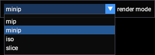
mode, modes = 1, ["mip", "minip", "iso", "slice"]

changed, mode = imgui.combo("render mode", mode, modes)

The list is drawn while the box is open:
mode, modes = 1, ["mip", "minip", "iso", "slice"]

changed, mode = imgui.combo("render mode", mode, modes)
begin_combo#
flags takes imgui.ComboFlags_
Use these instead of combo when the items are not plain strings, the body draws whatever it likes. Call
end_combo only when begin_combo returned True.
Parameters
label- drawn to the right of the boxpreview_value- drawn in the box while it is closed
selected, graphics = "line-1", ["line-1", "line-2", "scatter-1"]

if imgui.begin_combo("graphic", selected):
    for name in graphics:
        clicked, _ = imgui.selectable(name, name == selected)
        if clicked:
            selected = name

    imgui.end_combo()

end_combo#
- imgui.end_combo() None
only call EndCombo() if BeginCombo() returns True!
Call it only when the matching begin_combo returned True.
Parameters
none
list_box#
- imgui.list_box(label: str, current_item: int, items: Sequence[str], height_in_items: int = -1) tuple[bool, int]
A list box shows several items at once, a combo box hides them until it is opened.
Parameters
label- drawn to the right of the boxcurrent_item- index of the selected itemitems- the items, as a sequence of stringsheight_in_items- how many items are visible before the box scrolls
Returns: (changed, current_item)
selected, graphics = 0, ["line-1", "line-2", "scatter-1", "image-1"]

changed, selected = imgui.list_box("graphics", selected, graphics, height_in_items=4)

begin_list_box#
Note
If size is None, then its default value will be: ImVec2(0, 0)
Parameters
label- drawn to the right of the boxsize-(width, height), a zero component is a default size
selected, graphics = "line-1", ["line-1", "line-2", "scatter-1"]

if imgui.begin_list_box("graphics", (160, 70)):
    for name in graphics:
        clicked, _ = imgui.selectable(name, name == selected)
        if clicked:
            selected = name

    imgui.end_list_box()

end_list_box#
- imgui.end_list_box() None
only call EndListBox() if BeginListBox() returned True!
Call it only when the matching begin_list_box returned True.
Parameters
none
selectable#
- imgui.selectable(label: str, p_selected: bool, flags: int = 0, size: ImVec2 | None = None) tuple[bool, bool]
“bool* p_selected” point to the selection state (read-write), as a convenient helper.
flags takes imgui.SelectableFlags_
Note
If size is None, then its default value will be: ImVec2(0, 0)
A row of text that can be selected, and the item to build lists out of.
Parameters
label- drawn in the rowp_selected- whether this row is drawn as selectedsize-(width, height), a zero component fills the available width
Returns: (clicked, p_selected)
selected = "scatter-1"

for name in ["line-1", "line-2", "scatter-1"]:
    clicked, _ = imgui.selectable(name, name == selected)
    if clicked:
        selected = name

Color#
A color is a list of floats in 0.0 to 1.0, three of them for RGB and four for RGBA. The 3 and 4
variants differ only in whether they include alpha.
color_edit3#
flags takes imgui.ColorEditFlags_
A row of numeric fields with a color square at its right end. Clicking the square opens a picker, right-clicking it opens a menu of display options.
Parameters
label- drawn to the right of the fields,"##hidden"suppresses itcol- the current color
Returns: (changed, col)
color = [0.9, 0.3, 0.2]

changed, color = imgui.color_edit3("line color", color)

color_edit4#
flags takes imgui.ColorEditFlags_
color_edit3 with an alpha field.
Parameters
label- drawn to the right of the fieldscol- the current color
Returns: (changed, col)
color = [0.9, 0.3, 0.2, 0.5]

changed, color = imgui.color_edit4("fill color", color)

color_picker3#
flags takes imgui.ColorEditFlags_
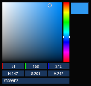
The full picker, drawn inline. color_edit3 is the compact element and opens this in a popup when its square is
clicked.
Parameters
label- drawn above the pickercol- the current color
Returns: (changed, col)
color = [0.2, 0.6, 0.95]

changed, color = imgui.color_picker3("##picker", color)
color_picker4#
- imgui.color_picker4(label: str, col: Sequence[float], flags: int = 0, ref_col: float | None = None) tuple[bool, list[float]]
flags takes imgui.ColorEditFlags_
color_picker3 with an alpha bar.
Parameters
label- drawn to the right of the pickercol- the current colorref_col- a second color drawn beside the current one, to compare against
Returns: (changed, col)
color = [0.2, 0.6, 0.95, 0.7]

changed, color = imgui.color_picker4("##picker4", color)

color_button#
- imgui.color_button(desc_id: str, col: ImVec4, flags: int = 0, size: ImVec2 | None = None) bool
display a color square/button, hover for details, return True when pressed.
flags takes imgui.ColorEditFlags_
Note
If size is None, then its default value will be: ImVec2(0, 0)
Parameters
desc_id- identifies the button, and is shown in its tooltipcol- the color to draw,(r, g, b, a)size-(width, height), a zero component is a square the height of one row
Returns: True on the frame the button is clicked
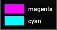
for name, color in [("magenta", (1.0, 0.0, 1.0, 1.0)), ("cyan", (0.0, 1.0, 1.0, 1.0))]:
    if imgui.color_button(name, color, size=(40, 20)):
        print(f"{name} clicked")

    imgui.same_line()
    imgui.text(name)
set_color_edit_options#
- imgui.set_color_edit_options(flags: int) None
initialize current options (generally on application startup) if you want to select a default format, picker type, etc. User will be able to change many settings, unless you pass the _NoOptions flag to your calls.
flags takes imgui.ColorEditFlags_
Sets the defaults for every color element that follows, so each one does not have to pass the same flags. Call it once when the UI is created.
Parameters
flags- the options to apply
imgui.set_color_edit_options(int(imgui.ColorEditFlags_.float) | int(imgui.ColorEditFlags_.display_hsv))

color = [0.9, 0.3, 0.2]
changed, color = imgui.color_edit3("line color", color)

Trees and tabs#
tree_node#
Overloads
- imgui.tree_node(str_id: str, fmt: str) bool
helper variation to easily decorrelate the id from the displayed string. Read the FAQ about why and how to use ID. to align arbitrary text at the same level as a TreeNode() you can use Bullet().
Returns True while the node is open, in which case its contents are drawn and tree_pop must be called. The
node is opened and closed by the user, clicking the arrow.
Parameters
label- drawn next to the arrow, and used as the idstr_id,ptr_id- an id given separately, for when the label is not unique or changes between framesfmt- the text to draw when an id is given separately
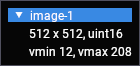
if imgui.tree_node("image-1"):
    imgui.text("512 x 512, uint16")
    imgui.text("vmin 12, vmax 208")
    imgui.tree_pop()
tree_node_ex#
Overloads
flags takes imgui.TreeNodeFlags_
tree_node with flags, e.g. to have the node start open, or to draw it without an arrow.
Parameters
label- drawn next to the arrow, and used as the idstr_id,ptr_id- an id given separatelyfmt- the text to draw when an id is given separately
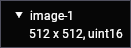
if imgui.tree_node_ex("image-1", flags=imgui.TreeNodeFlags_.default_open):
    imgui.text("512 x 512, uint16")
    imgui.tree_pop()
tree_pop#
- imgui.tree_pop() None
~ Unindent()+PopID()
Parameters
none
collapsing_header#
Overloads
- imgui.collapsing_header(label: str, flags: int = 0) bool
if returning ‘True’ the header is open. doesn’t indent nor push on ID stack. user doesn’t have to call TreePop().
- imgui.collapsing_header(label: str, p_visible: bool, flags: int = 0) tuple[bool, bool]
when ‘p_visible != None’: if ‘*p_visible==True’ display an additional small close button on upper right of the header which will set the bool to False when clicked, if ‘*p_visible==False’ don’t display the header.
flags takes imgui.TreeNodeFlags_
A header that shows and hides a section. Unlike a tree node it does not indent its contents and needs no
tree_pop, which makes it the element for grouping controls.
Parameters
label- drawn in the headerp_visible- when given, a close button is drawn and this is set toFalsewhen it is clicked
Returns: True while the header is open, or (open, p_visible) for the second form
sigma = 1.4

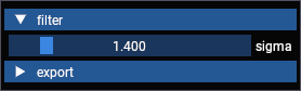
if imgui.collapsing_header("filter", flags=imgui.TreeNodeFlags_.default_open):
    changed, sigma = imgui.slider_float("sigma", v=sigma, v_min=0.1, v_max=10.0)

if imgui.collapsing_header("export"):
    imgui.text("not shown while the header is closed")
set_next_item_open#
- imgui.set_next_item_open(is_open: bool, cond: int = 0) None
set next TreeNode/CollapsingHeader open state.
Opens or closes the next tree node or collapsing header from code, rather than waiting for the user to click it.
Parameters
is_open- the state to setcond- animgui.Cond_value, e.g.onceto set it only the first time
imgui.set_next_item_open(True, imgui.Cond_.once)

if imgui.tree_node("image-1"):
    imgui.text("open because set_next_item_open was called")
    imgui.tree_pop()

begin_tab_bar#
flags takes imgui.TabBarFlags_
Parameters
str_id- identifies the tab bar, it is not drawn
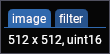
if imgui.begin_tab_bar("panels"):
    if imgui.begin_tab_item("image")[0]:
        imgui.text("512 x 512, uint16")
        imgui.end_tab_item()

    if imgui.begin_tab_item("filter")[0]:
        imgui.text("gaussian, sigma 1.4")
        imgui.end_tab_item()

    imgui.end_tab_bar()
end_tab_bar#
- imgui.end_tab_bar() None
only call EndTabBar() if BeginTabBar() returns True!
Call it only when the matching begin_tab_bar returned True.
Parameters
none
begin_tab_item#
- imgui.begin_tab_item(label: str, p_open: bool | None = None, flags: int = 0) tuple[bool, bool | None]
create a Tab. Returns True if the Tab is selected.
flags takes imgui.TabItemFlags_
Parameters
label- drawn on the tabp_open- when given, a close button is drawn on the tab and this is set toFalsewhen it is clicked
Returns: (selected, p_open), draw the contents and call end_tab_item while selected
if imgui.begin_tab_bar("panels"):
    for label in ["image", "filter", "export"]:
        selected, _ = imgui.begin_tab_item(label)
        if selected:
            imgui.text(f"{label} panel")
            imgui.end_tab_item()

    imgui.end_tab_bar()

end_tab_item#
- imgui.end_tab_item() None
only call EndTabItem() if BeginTabItem() returns True!
Call it only when the matching begin_tab_item returned True.
Parameters
none
tab_item_button#
- imgui.tab_item_button(label: str, flags: int = 0) bool
create a Tab behaving like a button. return True when clicked. cannot be selected in the tab bar.
flags takes imgui.TabItemFlags_
Parameters
label- drawn on the tab
Returns: True on the frame the tab is clicked
if imgui.begin_tab_bar("panels"):
    if imgui.begin_tab_item("image")[0]:
        imgui.end_tab_item()

    if imgui.tab_item_button("+"):
        print("add panel")

    imgui.end_tab_bar()

Menus#
A menu bar belongs to a window, so the window has to be created with imgui.WindowFlags_.menu_bar.
begin_menu_bar#
- imgui.begin_menu_bar() bool
append to menu-bar of current window (requires ImGuiWindowFlags_MenuBar flag set on parent window).
Parameters
none
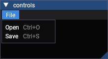
imgui.set_next_window_pos((0, 0))
imgui.set_next_window_size((220, 120))
imgui.begin("controls", flags=imgui.WindowFlags_.menu_bar)

if imgui.begin_menu_bar():
    if imgui.begin_menu("File"):
        imgui.menu_item("Open", "Ctrl+O", False)
        imgui.menu_item("Save", "Ctrl+S", False)
        imgui.end_menu()

    imgui.end_menu_bar()

imgui.end()
begin_main_menu_bar#
- imgui.begin_main_menu_bar() bool
create and append to a full screen menu-bar.
A bar pinned across the top of the canvas, it is not part of any window.
Parameters
none
if imgui.begin_main_menu_bar():
    if imgui.begin_menu("File"):
        imgui.menu_item("Open", "Ctrl+O", False)
        imgui.end_menu()

    if imgui.begin_menu("Help"):
        imgui.menu_item("Version", "", False)
        imgui.end_menu()

    imgui.end_main_menu_bar()

begin_menu#
- imgui.begin_menu(label: str, enabled: bool = True) bool
create a sub-menu entry. only call EndMenu() if this returns True!
Returns True while the menu is open, in which case its items are drawn and end_menu must be called. A
begin_menu inside another one is a submenu.
Parameters
label- drawn on the menuenabled- a disabled menu is drawn greyed out and cannot be opened
imgui.set_next_window_pos((0, 0))
imgui.set_next_window_size((240, 130))
imgui.begin("controls", flags=imgui.WindowFlags_.menu_bar)

if imgui.begin_menu_bar():
    if imgui.begin_menu("Graphics"):
        imgui.menu_item("Add line", "", False)

        if imgui.begin_menu("Add image"):
            imgui.menu_item("from file", "", False)
            imgui.menu_item("from array", "", False)
            imgui.end_menu()

        imgui.end_menu()

    imgui.end_menu_bar()

imgui.end()

menu_item#
- imgui.menu_item(label: str, shortcut: str, p_selected: bool, enabled: bool = True) tuple[bool, bool]
return True when activated + toggle (*p_selected) if p_selected != None
Parameters
label- drawn on the itemshortcut- drawn right-aligned on the item, it is a label only and does not bind the keyp_selected- whenTruea check mark is drawn, pass it a bool to make the item a toggleenabled- a disabled item is drawn greyed out and cannot be clicked
Returns: (clicked, p_selected)
show_fps = True

imgui.set_next_window_pos((0, 0))
imgui.set_next_window_size((230, 120))
imgui.begin("controls", flags=imgui.WindowFlags_.menu_bar)

if imgui.begin_menu_bar():
    if imgui.begin_menu("View"):
        clicked, show_fps = imgui.menu_item("Show fps", "", show_fps)
        imgui.menu_item("Autoscale", "A", False)
        imgui.menu_item("Reset camera", "", False, enabled=False)
        imgui.end_menu()

    imgui.end_menu_bar()

imgui.end()

Popups and tooltips#
A popup is opened by open_popup and drawn by begin_popup, which returns True only while it is open. Both
have to be called for the same window, so calling open_popup from inside a menu does not open a popup that
begin_popup draws outside of it.
open_popup#
Overloads
- imgui.open_popup(str_id: str, popup_flags: int = 0) None
call to mark popup as open (don’t call every frame!).
- imgui.open_popup(id_: int, popup_flags: int = 0) None
id overload to facilitate calling from nested stacks
popup_flags takes imgui.PopupFlags_
Parameters
str_id- identifies the popup,begin_popupis called with the same idid_- an integer id instead of a string onepopup_flags- options such as not opening over a popup that is already open
if imgui.button("options"):
    imgui.open_popup("options")

if imgui.begin_popup("options"):
    imgui.menu_item("reset vmin / vmax", "", False)
    imgui.menu_item("reset gamma", "", False)
    imgui.end_popup()

begin_popup#
- imgui.begin_popup(str_id: str, flags: int = 0) bool
return True if the popup is open, and you can start outputting to it.
flags takes imgui.WindowFlags_
Call end_popup only when begin_popup returned True. The popup closes when the user clicks outside it, or
when a menu item inside it is clicked.
Parameters
str_id- the id thatopen_popupwas called with
sigma = 1.4

if imgui.button("filter"):
    imgui.open_popup("filter")

if imgui.begin_popup("filter"):
    changed, sigma = imgui.slider_float("sigma", v=sigma, v_min=0.1, v_max=10.0)
    imgui.end_popup()

end_popup#
- imgui.end_popup() None
only call EndPopup() if BeginPopupXXX() returns True!
Call it only when the matching begin_popup returned True.
Parameters
none
begin_popup_modal#
- imgui.begin_popup_modal(name: str, p_open: bool | None = None, flags: int = 0) tuple[bool, bool | None]
return True if the modal is open, and you can start outputting to it.
flags takes imgui.WindowFlags_
A modal has a title bar and blocks everything behind it until it is closed. Passing p_open draws a close button in
its title bar.
Parameters
name- the id thatopen_popupwas called with, and the titlep_open- when given, a close button is drawn and imgui closes the modal when it is clicked
Returns: (open, p_open)
if imgui.button("about"):
    imgui.open_popup("About")

if imgui.begin_popup_modal("About", True)[0]:
    imgui.text("fastplotlib")
    imgui.end_popup()

close_current_popup#
- imgui.close_current_popup() None
manually close the popup we have begin-ed into.
Closes the popup being drawn, for a control that should dismiss it. A menu item already does this on its own.
Parameters
none
if imgui.button("options"):
    imgui.open_popup("options")

if imgui.begin_popup("options"):
    imgui.text("apply the filter to every frame?")

    if imgui.button("cancel"):
        imgui.close_current_popup()

    imgui.end_popup()

begin_popup_context_item#
- imgui.begin_popup_context_item(str_id: str | None = None, popup_flags: int = 0) bool
open+begin popup when clicked on last item. Use str_id==None to associate the popup to previous item. If you want to use that on a non-interactive item such as Text() you need to pass in an explicit ID here. read comments in .cpp!
popup_flags takes imgui.PopupFlags_
Opens on a right-click on the element that precedes it, so a right-click menu needs no open_popup of its own.
Parameters
str_id- identifies the popup, the preceding element is used when it is not givenpopup_flags- which mouse button opens it, right by default
imgui.button("line-1")

if imgui.begin_popup_context_item():
    imgui.menu_item("hide", "", False)
    imgui.menu_item("delete", "", False)
    imgui.end_popup()

begin_popup_context_window#
- imgui.begin_popup_context_window(str_id: str | None = None, popup_flags: int = 0) bool
open+begin popup when clicked on current window.
popup_flags takes imgui.PopupFlags_
Opens on a right-click anywhere in the window that is not over an element.
Parameters
str_id- identifies the popuppopup_flags- which mouse button opens it, right by default
imgui.text("right click the window")

if imgui.begin_popup_context_window():
    imgui.menu_item("add line", "", False)
    imgui.menu_item("add image", "", False)
    imgui.end_popup()

is_popup_open#
flags takes imgui.PopupFlags_
Parameters
str_id- the id the popup was opened withflags- useimgui.PopupFlags_.any_popup_idto ask about any popup
Returns: True while the popup is open
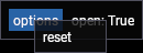
if imgui.button("options"):
    imgui.open_popup("options")

imgui.same_line()
imgui.text(f"open: {imgui.is_popup_open('options')}")

if imgui.begin_popup("options"):
    imgui.menu_item("reset", "", False)
    imgui.end_popup()
set_tooltip#
- imgui.set_tooltip(fmt: str) None
set a text-only tooltip. Often used after a ImGui::IsItemHovered() check. Override any previous call to SetTooltip().
Parameters
fmt- the text to draw in the tooltip
imgui.button(fa.ICON_FA_MAXIMIZE)

if imgui.is_item_hovered():
    imgui.set_tooltip("autoscale scene")

set_item_tooltip#
- imgui.set_item_tooltip(fmt: str) None
set a text-only tooltip if preceding item was hovered. override any previous call to SetTooltip().
The same as set_tooltip behind an is_item_hovered check, for the common case of a tooltip on the element that
precedes it.
Parameters
fmt- the text to draw in the tooltip
imgui.button(fa.ICON_FA_ALIGN_CENTER)
imgui.set_item_tooltip("center scene")

begin_tooltip#
- imgui.begin_tooltip() bool
begin/append a tooltip window.
A tooltip that holds any elements, not only text. Call end_tooltip only when begin_tooltip returned True.
Parameters
none
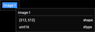
imgui.button("image-1")

if imgui.is_item_hovered() and imgui.begin_tooltip():
    imgui.text("image-1")
    imgui.separator()
    imgui.label_text("shape", "(512, 512)")
    imgui.label_text("dtype", "uint16")
    imgui.end_tooltip()
end_tooltip#
- imgui.end_tooltip() None
only call EndTooltip() if BeginTooltip()/BeginItemTooltip() returns True!
Call it only when the matching begin_tooltip returned True.
Parameters
none
Layout#
Elements are stacked vertically in the order they are called. These change where the next element goes, so most of them draw nothing by themselves and are shown here between elements that do.
same_line#
- imgui.same_line(offset_from_start_x: float = 0.0, spacing: float = -1.0) None
call between widgets or groups to layout them horizontally. X position given in window coordinates.
Parameters
offset_from_start_x- x position in window coordinates, the default continues after the previous elementspacing- gap in pixels, the default uses the style spacing
imgui.button("apply")
imgui.same_line()
imgui.button("reset")

new_line#
- imgui.new_line() None
undo a SameLine() or force a new line when in a horizontal-layout context.
Parameters
none
imgui.button("apply")
imgui.same_line()
imgui.new_line()
imgui.button("reset")

separator#
- imgui.separator() None
separator, generally horizontal. inside a menu bar or in horizontal layout mode, this becomes a vertical separator.
Parameters
none
imgui.text("filter")
imgui.separator()
imgui.text("export")

spacing#
- imgui.spacing() None
add vertical spacing.
Parameters
none
imgui.button("apply")
imgui.spacing()
imgui.spacing()
imgui.button("reset")

dummy#
- imgui.dummy(size: ImVec2) None
add a dummy item of given size. unlike InvisibleButton(), Dummy() won’t take the mouse click or be navigable into.
An empty element of a given size, to leave a gap that spacing cannot make. It takes no pointer input, unlike
invisible_button.
Parameters
size-(width, height)of the gap
imgui.button("apply")
imgui.same_line()
imgui.dummy((40, 0))
imgui.same_line()
imgui.button("delete")

indent#
- imgui.indent(indent_w: float = 0.0) None
move content position toward the right, by indent_w, or style.IndentSpacing if indent_w <= 0
Parameters
indent_w- width in pixels, the default uses the style indent
imgui.text("filter")
imgui.indent()
imgui.text("gaussian, sigma 1.4")
imgui.text("applied to every frame")
imgui.unindent()
imgui.text("export")

unindent#
- imgui.unindent(indent_w: float = 0.0) None
move content position back to the left, by indent_w, or style.IndentSpacing if indent_w <= 0
Parameters
indent_w- width in pixels, the default uses the style indent
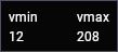
begin_group#
- imgui.begin_group() None
lock horizontal starting position
Everything between them becomes one item, so same_line places the whole group and is_item_hovered covers all of
it.
Parameters
none
imgui.begin_group()
imgui.text("vmin")
imgui.text("12")
imgui.end_group()

imgui.same_line()
imgui.dummy((20, 0))
imgui.same_line()

imgui.begin_group()
imgui.text("vmax")
imgui.text("208")
imgui.end_group()
end_group#
- imgui.end_group() None
unlock horizontal starting position + capture the whole group bounding box into one “item” (so you can use IsItemHovered() or layout primitives such as SameLine() on whole group, etc.)
Ends the group, and makes everything in it one item for same_line and the item queries.
Parameters
none
align_text_to_frame_padding#
- imgui.align_text_to_frame_padding() None
vertically align upcoming text baseline to FramePadding.y so that it will align properly to regularly framed items (call if you have text on a line before a framed item)
Text is drawn without a frame, so on a row shared with a slider or a button it sits too high. Call this before the text to line them up.
Parameters
none
sigma = 1.4

imgui.align_text_to_frame_padding()
imgui.text("sigma")
imgui.same_line()
changed, sigma = imgui.slider_float("##sigma", v=sigma, v_min=0.1, v_max=10.0)

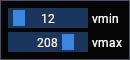
set_next_item_width#
- imgui.set_next_item_width(item_width: float) None
set width of the _next_ common large “item+label” widget. >0.0: width in pixels, <0.0 align xx pixels to the right of window (so -FLT_MIN always align width to the right side)
Parameters
item_width- width in pixels, a negative value leaves that many pixels between the element and the right edge
vmin, vmax = 12.0, 208.0

imgui.set_next_item_width(80)
changed, vmin = imgui.slider_float("vmin", v=vmin, v_min=0.0, v_max=255.0, format="%.0f")

imgui.set_next_item_width(80)
changed, vmax = imgui.slider_float("vmax", v=vmax, v_min=0.0, v_max=255.0, format="%.0f")
push_item_width#
- imgui.push_item_width(item_width: float) None
push width of items for common large “item+label” widgets. >0.0: width in pixels, <0.0 align xx pixels to the right of window (so -FLT_MIN always align width to the right side).
The same as set_next_item_width but for every element until pop_item_width.
Parameters
item_width- width in pixels, a negative value leaves that many pixels between the element and the right edge
vmin, vmax = 12.0, 208.0

imgui.push_item_width(80)
changed, vmin = imgui.slider_float("vmin", v=vmin, v_min=0.0, v_max=255.0, format="%.0f")
changed, vmax = imgui.slider_float("vmax", v=vmax, v_min=0.0, v_max=255.0, format="%.0f")
imgui.pop_item_width()

pop_item_width#
- imgui.pop_item_width() None
Pops the width that push_item_width pushed.
Parameters
none
calc_text_size#
- imgui.calc_text_size(text: str, text_end: str | None = None, hide_text_after_double_hash: bool = False, wrap_width: float = -1.0) ImVec2
Text Utilities
Parameters
text- the text to measuretext_end- measure up to this substringhide_text_after_double_hash- ignore everything after##, as the elements do with their labelswrap_width- measure as if the text were wrapped at this width
Returns: the size, use .x and .y
label = "vmin / vmax"
size = imgui.calc_text_size(label)

imgui.text(label)
imgui.text(f"that text is {size.x:.0f} x {size.y:.0f} px")

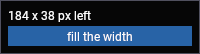
get_content_region_avail#
- imgui.get_content_region_avail() ImVec2
available space from current position. THIS IS YOUR BEST FRIEND.
The space left in the window from the current position, which is how an element is sized to fill the window.
Parameters
none
Returns: the available size, use .x and .y
available = imgui.get_content_region_avail()

imgui.text(f"{available.x:.0f} x {available.y:.0f} px left")
imgui.button("fill the width", (available.x, 0))
get_cursor_pos#
- imgui.get_cursor_pos() ImVec2
[window-local] cursor position in window-local coordinates. This is not your best friend.
Where the next element goes, in window coordinates.
Parameters
local_pos-(x, y)in window coordinates
imgui.set_cursor_pos((60, 30))
imgui.button("moved")

set_cursor_pos#
- imgui.set_cursor_pos(local_pos: ImVec2) None
[window-local] “
Moves the position of the next element, in window coordinates.
Parameters
local_pos-(x, y)in window coordinates
imgui.set_cursor_pos((60, 30))
imgui.button("moved")

get_cursor_screen_pos#
- imgui.get_cursor_screen_pos() ImVec2
cursor position, absolute coordinates. THIS IS YOUR BEST FRIEND (prefer using this rather than GetCursorPos(), also more useful to work with ImDrawList API).
The same position in canvas coordinates, which is what a draw list takes.
Parameters
pos-(x, y)in canvas coordinates
draw_list = imgui.get_window_draw_list()
position = imgui.get_cursor_screen_pos()

draw_list.add_rect_filled(
    position,
    (position.x + 60, position.y + 20),
    imgui.color_convert_float4_to_u32((0.2, 0.6, 0.95, 1.0)),
)
imgui.dummy((60, 20))

set_cursor_screen_pos#
- imgui.set_cursor_screen_pos(pos: ImVec2) None
cursor position, absolute coordinates. THIS IS YOUR BEST FRIEND.
Moves the position of the next element, in canvas coordinates.
Parameters
pos-(x, y)in canvas coordinates
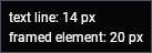
get_text_line_height#
- imgui.get_text_line_height() float
~ FontSize
The height of a line of text, and the height of an element that has a frame such as a button or a slider. Use them to size something you draw yourself so that it lines up with the elements around it.
Parameters
none
imgui.text(f"text line: {imgui.get_text_line_height():.0f} px")
imgui.text(f"framed element: {imgui.get_frame_height():.0f} px")
get_frame_height#
- imgui.get_frame_height() float
~ FontSize + style.FramePadding.y * 2
The height of an element that has a frame, such as a button or a slider.
Parameters
none
Returns: the height in pixels
imgui.text(f"framed element: {imgui.get_frame_height():.0f} px")

Windows#
In fastplotlib the window is created for you, ImguiWindow.update() draws into it. These are for a window you create
yourself, inside an overridden ImguiWindow.draw().
begin#
flags takes imgui.WindowFlags_
end is called whether or not begin returned True. begin returns False when the window is collapsed,
in which case its contents can be skipped.
Parameters
name- the title, and the id of the window,"title##id"separates the twop_open- when given, a close button is drawn in the title bar and this is set toFalsewhen it is clicked
Returns: (expanded, p_open)
expanded, open_ = imgui.begin("filter", True)

if expanded:
    imgui.text("gaussian")

imgui.end()

end#
- imgui.end() None
Called whether or not begin returned True.
Parameters
none
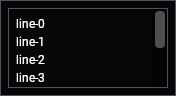
begin_child#
Overloads
- imgui.begin_child(str_id: str, size: ImVec2 | None = None, child_flags: int = 0, window_flags: int = 0) bool
- imgui.begin_child(id_: int, size: ImVec2 | None = None, child_flags: int = 0, window_flags: int = 0) bool
child_flags takes imgui.ChildFlags_
window_flags takes imgui.WindowFlags_
Note
If size is None, then its default value will be: ImVec2(0, 0)
A region within a window, with its own scrolling and clipping. Use it for a list that should scroll on its own.
Parameters
str_id,id_- identifies the regionsize-(width, height), a zero component fills the available space, a negative one leaves that many pixels
if imgui.begin_child("graphics", (160, 80), child_flags=imgui.ChildFlags_.borders):
    for i in range(8):
        imgui.text(f"line-{i}")

    imgui.end_child()
end_child#
- imgui.end_child() None
Call it only when the matching begin_child returned True.
Parameters
none
set_next_window_pos#
- imgui.set_next_window_pos(pos: ImVec2, cond: int = 0, pivot: ImVec2 | None = None) None
set next window position. call before Begin(). use pivot=(0.5,0.5) to center on given point, etc.
Note
If pivot is None, then its default value will be: ImVec2(0, 0)
Parameters
pos-(x, y)in canvas coordinatescond- animgui.Cond_value, e.g.appearingto place it only when it first appears so the user can move itpivot- which point of the window lands onpos,(0.5, 0.5)centers it there
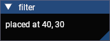
imgui.set_next_window_pos((40, 30))
imgui.set_next_window_size((160, 60))
imgui.begin("filter")
imgui.text("placed at 40, 30")
imgui.end()
set_next_window_size#
- imgui.set_next_window_size(size: ImVec2, cond: int = 0) None
set next window size. set axis to 0.0 to force an auto-fit on this axis. call before Begin()
Parameters
size-(width, height), a zero component makes that axis fit its contentscond- animgui.Cond_value
imgui.set_next_window_size((150, 0))
imgui.begin("filter")
imgui.text("fixed width, auto height")
imgui.end()

set_next_window_collapsed#
- imgui.set_next_window_collapsed(collapsed: bool, cond: int = 0) None
set next window collapsed state. call before Begin()
Parameters
collapsed- the state to setcond- animgui.Cond_value
imgui.set_next_window_collapsed(True)
imgui.begin("filter")
imgui.text("not drawn while collapsed")
imgui.end()

get_window_pos#
- imgui.get_window_pos() ImVec2
get current window position in screen space (IT IS UNLIKELY YOU EVER NEED TO USE THIS. Consider always using GetCursorScreenPos() and GetContentRegionAvail() instead)
The position and size of the window being drawn. For laying out contents, get_content_region_avail is what you
want, since it accounts for padding and for the position within the window.
Parameters
none
size = imgui.get_window_size()

imgui.text(f"window: {size.x:.0f} x {size.y:.0f} px")

get_window_size#
- imgui.get_window_size() ImVec2
get current window size (IT IS UNLIKELY YOU EVER NEED TO USE THIS. Consider always using GetCursorScreenPos() and GetContentRegionAvail() instead)
Parameters
none
Returns: the size, use .x and .y
size = imgui.get_window_size()

imgui.text(f"window: {size.x:.0f} x {size.y:.0f} px")

get_window_width#
- imgui.get_window_width() float
get current window width (IT IS UNLIKELY YOU EVER NEED TO USE THIS). Shortcut for GetWindowSize().x.
Parameters
none
Returns: the width in pixels
get_window_height#
- imgui.get_window_height() float
get current window height (IT IS UNLIKELY YOU EVER NEED TO USE THIS). Shortcut for GetWindowSize().y.
Parameters
none
Returns: the height in pixels
get_window_draw_list#
- imgui.get_window_draw_list() ImDrawList
get draw list associated to the current window, to append your own drawing primitives
The draw list of the window, for drawing shapes and text yourself. Positions are in canvas coordinates, so they start
from get_cursor_screen_pos.
Parameters
none
Returns: an imgui.ImDrawList
draw_list = imgui.get_window_draw_list()
position = imgui.get_cursor_screen_pos()

white = imgui.color_convert_float4_to_u32((1.0, 1.0, 1.0, 1.0))
blue = imgui.color_convert_float4_to_u32((0.2, 0.6, 0.95, 1.0))

draw_list.add_rect_filled(position, (position.x + 120, position.y + 8), blue)
draw_list.add_circle_filled((position.x + 30, position.y + 30), 8, white)
draw_list.add_text((position.x + 50, position.y + 22), white, "drawn by hand")

imgui.dummy((120, 45))

set_scroll_here_y#
- imgui.set_scroll_here_y(center_y_ratio: float = 0.5) None
adjust scrolling amount to make current cursor position visible. center_y_ratio=0.0: top, 0.5: center, 1.0: bottom. When using to make a “default/current item” visible, consider using SetItemDefaultFocus() instead.
set_scroll_here_y scrolls to the element that was just drawn, which is how a list follows a selection.
Parameters
center_y_ratio- where the element ends up,0.0top,0.5center,1.0bottomscroll_y- the scroll amount in pixels
if imgui.begin_child("graphics", (160, 70), child_flags=imgui.ChildFlags_.borders):
    for i in range(10):
        imgui.text(f"line-{i}")

        if i == 6:
            imgui.set_scroll_here_y(0.5)

    imgui.end_child()

get_scroll_y#
- imgui.get_scroll_y() float
get scrolling amount [0 .. GetScrollMaxY()]
Parameters
none
Returns: the scroll amount in pixels
set_scroll_y#
Parameters
scroll_y- the scroll amount in pixels
Style and ids#
Every push has a matching pop. A push that is not popped leaks into everything drawn afterwards, including elements that fastplotlib draws.
push_id#
Overloads
- imgui.push_id(str_id_begin: str, str_id_end: str) None
push string into the ID stack (will hash string).
- imgui.push_id(ptr_id: typing_extensions.CapsuleType) None
push pointer into the ID stack (will hash pointer).
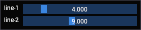
imgui identifies an element by its label, so two elements with the same label are the same element and share their state. Push an id around them to keep them apart, which is what a loop over graphics needs.
Parameters
str_id,int_id,ptr_id- the value to push, it is hashed and is not drawnstr_id_begin,str_id_end- a substring to push
thickness = {"line-1": 4.0, "line-2": 9.0}

for name in thickness:
    imgui.push_id(name)

    imgui.text(name)
    imgui.same_line()
    changed, thickness[name] = imgui.slider_float("##thickness", v=thickness[name], v_min=1.0, v_max=20.0)

    imgui.pop_id()
pop_id#
- imgui.pop_id() None
pop from the ID stack.
Pops the id that push_id pushed.
Parameters
none
push_style_color#
Overloads
- imgui.push_style_color(idx: int, col: int) None
modify a style color. always use this if you modify the style after NewFrame().
Parameters
idx- which color, animgui.Col_valuecol- the color,(r, g, b, a)or a packedintcount- how many pushes to pop
imgui.push_style_color(imgui.Col_.button, (0.6, 0.15, 0.15, 1.0))
imgui.push_style_color(imgui.Col_.button_hovered, (0.75, 0.2, 0.2, 1.0))

imgui.button("delete graphic")

imgui.pop_style_color(2)

imgui.button("keep graphic")

pop_style_color#
Parameters
count- how many pushed colors to pop
push_style_var#
Overloads
- imgui.push_style_var(idx: int, val: float) None
modify a style float variable. always use this if you modify the style after NewFrame()!
Parameters
idx- which variable, animgui.StyleVar_valueval- a float, or(x, y)for the variables that are a paircount- how many pushes to pop
imgui.push_style_var(imgui.StyleVar_.frame_rounding, 10.0)
imgui.button("rounded")
imgui.pop_style_var()

imgui.button("default")

pop_style_var#
Parameters
count- how many pushed variables to pop
get_style_color_vec4#
- imgui.get_style_color_vec4(idx: int) ImVec4
retrieve style color as stored in ImGuiStyle structure. use to feed back into PushStyleColor(), otherwise use GetColorU32() to get style color with style alpha baked in.
Parameters
idx- which color, animgui.Col_value
Returns: the color, use .x, .y, .z, .w for r, g, b, a
color = imgui.get_style_color_vec4(imgui.Col_.text)

imgui.text(f"text color: {color.x:.2f}, {color.y:.2f}, {color.z:.2f}")

get_color_u32#
Overloads
- imgui.get_color_u32(idx: int, alpha_mul: float = 1.0) int
retrieve given style color with style alpha applied and optional extra alpha multiplier, packed as a 32-bit value suitable for ImDrawList
- imgui.get_color_u32(col: ImVec4) int
retrieve given color with style alpha applied, packed as a 32-bit value suitable for ImDrawList
- imgui.get_color_u32(col: int, alpha_mul: float = 1.0) int
retrieve given color with style alpha applied, packed as a 32-bit value suitable for ImDrawList
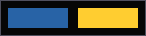
A draw list takes a packed 32-bit color, not a tuple. get_color_u32 packs a style color or your own color and
applies the global style alpha, color_convert_float4_to_u32 packs a color as it is.
Parameters
idx- which style color, animgui.Col_valuecol- a color,(r, g, b, a)or a packedintalpha_mul- multiplies the alphain_- the color to pack,(r, g, b, a)
Returns: the packed color
draw_list = imgui.get_window_draw_list()
position = imgui.get_cursor_screen_pos()

draw_list.add_rect_filled(
    position, (position.x + 60, position.y + 20), imgui.get_color_u32(imgui.Col_.button)
)
draw_list.add_rect_filled(
    (position.x + 70, position.y),
    (position.x + 130, position.y + 20),
    imgui.color_convert_float4_to_u32((1.0, 0.8, 0.2, 1.0)),
)

imgui.dummy((130, 20))
color_convert_float4_to_u32#
- imgui.color_convert_float4_to_u32(in_: ImVec4) int
Packs a color as it is, without applying the style alpha.
Parameters
in_- the color to pack,(r, g, b, a)
Returns: the packed color
get_font_size#
- imgui.get_font_size() float
get current scaled font size (= height in pixels). AFTER global scale factors applied. *IMPORTANT* DO NOT PASS THIS VALUE TO PushFont()! Use ImGui::GetStyle().FontSizeBase to get value before global scale factors.
Parameters
none
Returns: the height of the font in pixels
imgui.text(f"font size: {imgui.get_font_size():.0f} px")

begin_disabled#
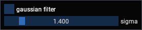
Everything between them is greyed out and takes no input, for a control that does not apply yet.
Parameters
disabled- passFalseto leave the elements enabled, so the call can be made unconditionally
apply_filter, sigma = False, 1.4

changed, apply_filter = imgui.checkbox("gaussian filter", apply_filter)

imgui.begin_disabled(not apply_filter)
changed, sigma = imgui.slider_float("sigma", v=sigma, v_min=0.1, v_max=10.0)
imgui.end_disabled()
end_disabled#
- imgui.end_disabled() None
Ends the block that begin_disabled started.
Parameters
none
Queries#
These ask about the element that was drawn last, about the window, or about the mouse and keyboard. The item queries refer to the element immediately above them, so they go straight after the element they ask about.
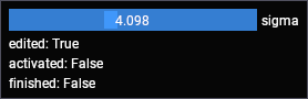
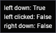
The examples below print what they return, and the images were captured with the pointer over the element or a button
held down, which is why they read True.
is_item_hovered#
- imgui.is_item_hovered(flags: int = 0) bool
is the last item hovered? (and usable, aka not blocked by a popup, etc.). See ImGuiHoveredFlags for more options.
flags takes imgui.HoveredFlags_
imgui.button("autoscale")
imgui.text(f"hovered: {imgui.is_item_hovered()}")

is_item_active#
- imgui.is_item_active() bool
is the last item active? (e.g. button being held, text field being edited. This will continuously return True while holding mouse button on an item. Items that don’t interact will always return False)
imgui.button("autoscale")
imgui.text(f"active: {imgui.is_item_active()}")

is_item_clicked#
- imgui.is_item_clicked(mouse_button: int = 0) bool
is the last item hovered and mouse clicked on? (**) == IsMouseClicked(mouse_button) && IsItemHovered()Important. (**) this is NOT equivalent to the behavior of e.g. Button(). Read comments in function definition.
Parameters
mouse_button-0left,1right,2middle
imgui.button("autoscale")
imgui.text(f"clicked: {imgui.is_item_clicked()}")

is_item_edited#
- imgui.is_item_edited() bool
did the last item modify its underlying value this frame? or was pressed? This is generally the same as the “bool” return value of many widgets.
is_item_deactivated_after_edit is the one to use for work that is too expensive to run while a slider is being
dragged, since it is True only on the frame the drag ends.
sigma = 1.4

changed, sigma = imgui.slider_float("sigma", v=sigma, v_min=0.1, v_max=10.0)

imgui.text(f"edited: {imgui.is_item_edited()}")
imgui.text(f"activated: {imgui.is_item_activated()}")
imgui.text(f"finished: {imgui.is_item_deactivated_after_edit()}")
is_item_activated#
- imgui.is_item_activated() bool
was the last item just made active (item was previously inactive).
True on the frame the element became active, e.g. the frame a drag started.
Parameters
none
sigma = 1.4

changed, sigma = imgui.slider_float("sigma", v=sigma, v_min=0.1, v_max=10.0)
imgui.text(f"activated: {imgui.is_item_activated()}")

is_item_deactivated_after_edit#
- imgui.is_item_deactivated_after_edit() bool
was the last item just made inactive and made a value change when it was active? (e.g. Slider/Drag moved). Useful for Undo/Redo patterns with widgets that require continuous editing. Note that you may get False positives (some widgets such as Combo()/ListBox()/Selectable() will return True even when clicking an already selected item).
True only on the frame an edit ends, which is what to use for work that is too expensive to run while a
slider is being dragged.
Parameters
none
sigma = 1.4

changed, sigma = imgui.slider_float("sigma", v=sigma, v_min=0.1, v_max=10.0)
imgui.text(f"finished: {imgui.is_item_deactivated_after_edit()}")

is_any_item_hovered#
- imgui.is_any_item_hovered() bool
is any item hovered?
imgui.button("autoscale")
imgui.button("center")

imgui.text(f"any hovered: {imgui.is_any_item_hovered()}")

is_window_hovered#
- imgui.is_window_hovered(flags: int = 0) bool
is current window hovered and hoverable (e.g. not blocked by a popup/modal)? See ImGuiHoveredFlags_ for options. IMPORTANT: If you are trying to check whether your mouse should be dispatched to Dear ImGui or to your underlying app, you should not use this function! Use the ‘io.WantCaptureMouse’ boolean for that! Refer to FAQ entry “How can I tell whether to dispatch mouse/keyboard to Dear ImGui or my application?” for details.
flags takes imgui.HoveredFlags_
imgui.text(f"window hovered: {imgui.is_window_hovered()}")
is_window_focused#
- imgui.is_window_focused(flags: int = 0) bool
is current window focused? or its root/child, depending on flags. see flags for options.
flags takes imgui.FocusedFlags_
imgui.text(f"window focused: {imgui.is_window_focused()}")
is_window_appearing#
- imgui.is_window_appearing() bool
True on the first frame the window is drawn, for setup that should happen once, such as sizing a table column.
Parameters
none
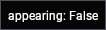
imgui.text(f"appearing: {imgui.is_window_appearing()}")
is_mouse_down#
These ask about the mouse anywhere, not about an element. A right-click that should open something belongs in
begin_popup_context_item instead.
Parameters
button-0left,1right,2middlerepeat- report repeats while the button is held
imgui.text(f"left down: {imgui.is_mouse_down(0)}")
imgui.text(f"left clicked: {imgui.is_mouse_clicked(0)}")
imgui.text(f"right down: {imgui.is_mouse_down(1)}")
is_mouse_clicked#
- imgui.is_mouse_clicked(button: int, repeat: bool = False) bool
did mouse button clicked? (went from !Down to Down). Same as GetMouseClickedCount() == 1.
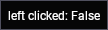
True on the frame the button goes down.
Parameters
button-0left,1right,2middlerepeat- report repeats while the button is held
imgui.text(f"left clicked: {imgui.is_mouse_clicked(0)}")
is_mouse_released#
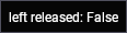
True on the frame the button goes up.
Parameters
button-0left,1right,2middle
imgui.text(f"left released: {imgui.is_mouse_released(0)}")
is_mouse_double_clicked#
- imgui.is_mouse_double_clicked(button: int) bool
did mouse button double-clicked? Same as GetMouseClickedCount() == 2. (note that a double-click will also report IsMouseClicked() == True)
True on the frame of the second click of a double click.
Parameters
button-0left,1right,2middle
imgui.text(f"double clicked: {imgui.is_mouse_double_clicked(0)}")
is_mouse_dragging#
- imgui.is_mouse_dragging(button: int, lock_threshold: float = -1.0) bool
is mouse dragging? (uses io.MouseDraggingThreshold if lock_threshold < 0.0)
The delta is measured from where the button went down. Reset it each frame to get the movement since the last frame, which is what a drag handle needs.
Parameters
button-0left,1right,2middlelock_threshold- how far the pointer must move before it counts as a drag, the default uses the style threshold
delta = imgui.get_mouse_drag_delta(0)

imgui.text(f"dragging: {imgui.is_mouse_dragging(0)}")
imgui.text(f"delta: {delta.x:.0f}, {delta.y:.0f}")

get_mouse_drag_delta#
- imgui.get_mouse_drag_delta(button: int = 0, lock_threshold: float = -1.0) ImVec2
return the delta from the initial clicking position while the mouse button is pressed or was just released. This is locked and return 0.0 until the mouse moves past a distance threshold at least once (uses io.MouseDraggingThreshold if lock_threshold < 0.0)
The movement since the button went down, in pixels.
Parameters
button-0left,1right,2middlelock_threshold- how far the pointer must move before it counts as a drag
Returns: the delta, use .x and .y
delta = imgui.get_mouse_drag_delta(0)

imgui.text(f"delta: {delta.x:.0f}, {delta.y:.0f}")

reset_mouse_drag_delta#
Sets the delta back to zero, call it each frame to get the movement since the last frame rather than since the button went down.
Parameters
button-0left,1right,2middle
get_mouse_pos#
- imgui.get_mouse_pos() ImVec2
shortcut to ImGui::GetIO().MousePos provided by user, to be consistent with other calls
Parameters
none
Returns: the pointer position in canvas coordinates, use .x and .y
position = imgui.get_mouse_pos()

imgui.text(f"pointer: {position.x:.0f}, {position.y:.0f}")

is_key_pressed#
- imgui.is_key_pressed(key: Key, repeat: bool = True) bool
was key pressed (went from !Down to Down)? Repeat rate uses io.KeyRepeatDelay / KeyRepeatRate.
Parameters
key- animgui.Keymember, e.g.imgui.Key.right_arrowrepeat- report repeats while the key is held
index = 42

if imgui.is_key_pressed(imgui.Key.right_arrow):
    index += 1

if imgui.is_key_pressed(imgui.Key.left_arrow):
    index -= 1

imgui.text(f"index: {index}")

is_key_down#
- imgui.is_key_down(key: Key) bool
is key being held.
True while the key is held, rather than only on the frame it goes down.
Parameters
key- animgui.Keymember
imgui.text(f"shift held: {imgui.is_key_down(imgui.Key.left_shift)}")
get_io#
- imgui.get_io() IO
access the ImGuiIO structure (mouse/keyboard/gamepad inputs, time, various configuration options/flags)
The imgui io structure. want_capture_mouse is the field to know about: it is True while imgui is using the
pointer, and fastplotlib relies on it to keep clicks on a UI from reaching the plot.
Parameters
none
Returns: an imgui.IO
io = imgui.get_io()

imgui.text(f"framerate: {io.framerate:.0f}")
imgui.text(f"capture mouse: {io.want_capture_mouse}")

Plots#
These draw a small line plot or histogram from an array of values, for a preview next to the controls. They are not a plotting library, a fastplotlib subplot is.
values must be a contiguous float32 array.
plot_lines#
- imgui.plot_lines(label: str, values: numpy.ndarray, values_offset: int = 0, overlay_text: str | None = None, scale_min: float = 3.4028234663852886e+38, scale_max: float = 3.4028234663852886e+38, graph_size: ImVec2 | None = None, stride: int = -1) None
Note
If graph_size is None, then its default value will be: ImVec2(0, 0)
Parameters
label- drawn to the right of the plot,"##hidden"suppresses itvalues- the values to plotvalues_offset- index to start from, for a ring bufferoverlay_text- text drawn over the plotscale_min,scale_max- the y range, the default fits the valuesgraph_size-(width, height), a zero component is a default sizestride- byte stride between values, for a column of a 2d array
values = np.sin(np.linspace(0, 4 * np.pi, 100)).astype(np.float32)

imgui.plot_lines("##trace", values, graph_size=(220, 60), overlay_text="channel 0")

plot_histogram#
- imgui.plot_histogram(label: str, values: numpy.ndarray, values_offset: int = 0, overlay_text: str | None = None, scale_min: float = 3.4028234663852886e+38, scale_max: float = 3.4028234663852886e+38, graph_size: ImVec2 | None = None, stride: int = -1) None
Note
If graph_size is None, then its default value will be: ImVec2(0, 0)
Parameters
label- drawn to the right of the plotvalues- the bin countsvalues_offset- index to start fromoverlay_text- text drawn over the plotscale_min,scale_max- the y range, the default fits the valuesgraph_size-(width, height), a zero component is a default sizestride- byte stride between values
data = np.random.normal(loc=120, scale=30, size=100_000)
counts = np.histogram(data, bins=64)[0].astype(np.float32)

imgui.plot_histogram("##histogram", counts, graph_size=(220, 60))
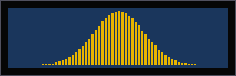
image#
- imgui.image(tex_ref: ImTextureRef, image_size: ImVec2, uv0: ImVec2 | None = None, uv1: ImVec2 | None = None) None
* uv0: ImVec2(0, 0) * uv1: ImVec2(1, 1)
Note
If any of the params below is None, then its default value below will be used:
Draws a texture that you have uploaded to the GPU and registered with the imgui renderer, which is how
ImguiColorbar draws its colormap bar. There is no example here because the texture has to come from the wgpu
device of the Figure:
texture_ref = figure.imgui_renderer.backend.register_texture(texture.create_view())
imgui.image(texture_ref, (24, 200))
Parameters
tex_ref- animgui.ImTextureReffromregister_textureimage_size-(width, height)to draw it atuv0,uv1- the region of the texture to draw,(0, 0)to(1, 1)by default
Tables#
A table is opened with begin_table, and end_table is called only when it returned True. Cells are filled by
walking rows and columns, either with table_next_column or by setting the column index.
begin_table#
- imgui.begin_table(str_id: str, columns: int, flags: int = 0, outer_size: ImVec2 | None = None, inner_width: float = 0.0) bool
flags takes imgui.TableFlags_
Note
If outer_size is None, then its default value will be: ImVec2(0.0, 0.0)
Parameters
str_id- identifies the tablecolumns- how many columnsouter_size-(width, height)of the table, a zero height fits the rowsinner_width- width of the scrolling region when the table scrolls horizontally
graphics = [("line-1", "LineGraphic", True), ("image-1", "ImageGraphic", False)]

if imgui.begin_table("graphics", 3, flags=imgui.TableFlags_.borders):
    for name, kind, visible in graphics:
        imgui.table_next_row()

        imgui.table_next_column()
        imgui.text(name)

        imgui.table_next_column()
        imgui.text(kind)

        imgui.table_next_column()
        imgui.text("visible" if visible else "hidden")

    imgui.end_table()
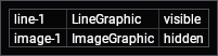
end_table#
- imgui.end_table() None
only call EndTable() if BeginTable() returns True!
Call it only when the matching begin_table returned True.
Parameters
none
table_next_row#
- imgui.table_next_row(row_flags: int = 0, min_row_height: float = 0.0) None
append into the first cell of a new row. ‘min_row_height’ include the minimum top and bottom padding aka CellPadding.y * 2.0.
row_flags takes imgui.TableRowFlags_
Parameters
min_row_height- minimum height of the row in pixels
if imgui.begin_table("frames", 2, flags=imgui.TableFlags_.borders):
    for index in range(3):
        imgui.table_next_row(min_row_height=24)

        imgui.table_next_column()
        imgui.text(f"frame {index}")

        imgui.table_next_column()
        imgui.text(f"{index * 40} ms")

    imgui.end_table()

table_next_column#
- imgui.table_next_column() bool
append into the next column (or first column of next row if currently in last column). Return True when column is visible.
table_next_column moves to the next cell, wrapping to the first column of the next row. Use
table_set_column_index to fill cells out of order.
Parameters
column_n- the column to move to
Returns: True when the column is visible, a clipped or hidden column can be skipped
if imgui.begin_table("stats", 2, flags=imgui.TableFlags_.borders):
    for label, value in [("vmin", "12"), ("vmax", "208")]:
        imgui.table_next_row()

        imgui.table_set_column_index(0)
        imgui.text(label)

        imgui.table_set_column_index(1)
        imgui.text(value)

    imgui.end_table()

table_set_column_index#
- imgui.table_set_column_index(column_n: int) bool
append into the specified column. Return True when column is visible.
Fills a cell out of order, rather than moving to the next one.
Parameters
column_n- the column to move to
Returns: True when the column is visible
table_setup_column#
- imgui.table_setup_column(label: str, flags: int = 0, init_width_or_weight: float = 0.0, user_id: int = 0) None
flags takes imgui.TableColumnFlags_
Declare the columns before any row, then table_headers_row draws one row with their labels.
Parameters
label- the column headerinit_width_or_weight- a starting width in pixels, or a share of the table width for a stretched column. imgui rejects it unless the sizing policy is explicit, so passimgui.TableColumnFlags_.width_fixedorwidth_stretchwith ituser_id- an id you can read back when sorting
if imgui.begin_table("graphics", 2, flags=imgui.TableFlags_.borders):
    imgui.table_setup_column("name", flags=imgui.TableColumnFlags_.width_fixed, init_width_or_weight=90)
    imgui.table_setup_column("type")
    imgui.table_headers_row()

    for name, kind in [("line-1", "LineGraphic"), ("image-1", "ImageGraphic")]:
        imgui.table_next_row()

        imgui.table_next_column()
        imgui.text(name)

        imgui.table_next_column()
        imgui.text(kind)

    imgui.end_table()
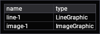
table_headers_row#
- imgui.table_headers_row() None
submit a row with headers cells based on data provided to TableSetupColumn() + submit context menu
Draws one row of headers from the labels given to table_setup_column.
Parameters
none